

Sector
Non-profit, Education
Timeframe
3 months
My Role
UI/UX, Research, Design System
Year
2023
SKARB NGO
A web platform for volunteers and businesses to network and collaborate

Project Overview
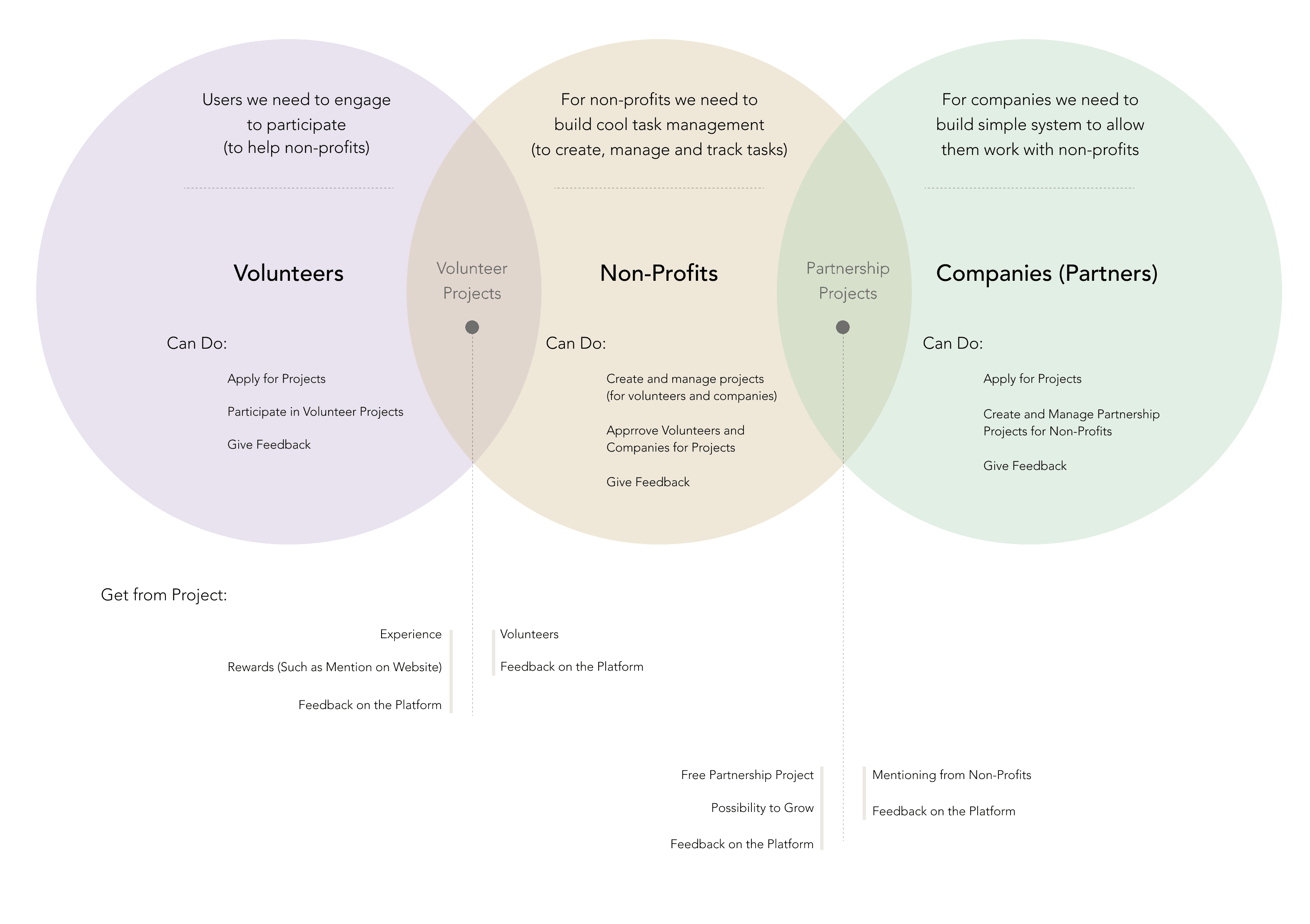
SKARB NGO is a platform for volunteers and non-profits helping them find a match based on their requests, skills, needs, and interests. This project was about building a platform for three types of users: volunteers, non-profits, and commercial companies.
My Role
For this project, I was working with another designer on research, design development and prototyping, brand identity creation, and delivering designs and guidelines to developers. My part of the work focused on user needs and the visual appearance of the website. My design partner was working more on the development of the experience and interfaces of website management part for site admins.
What I Was Working On
We divided all our work into several parts for sprint, and tried to focus on a few problems, starting with research and building a plan for future works, and then moving to the early stage of the development for all the pages, creating flows for tasks, wireframes and low-fi prototypes.

Whats This Project About
This project is about helping people. While defining problems and goals for each of the three types of our users, we realized that we needed to find a benefit that all of them can get from using our platform. Volunteering projects may be quite stressful both for volunteers and for companies. As such, we needed to ensure that volunteers are engaged on the whole way of working on tasks, and companies and non-profits have management tools that are as simple as possible for tasks.
Research
Finding Right Direction
This project had a very small budget. Therefore, we focused our research on analyzing other websites for volunteers. I was also using the experience I had gained working on a few graphic design projects as a volunteer.
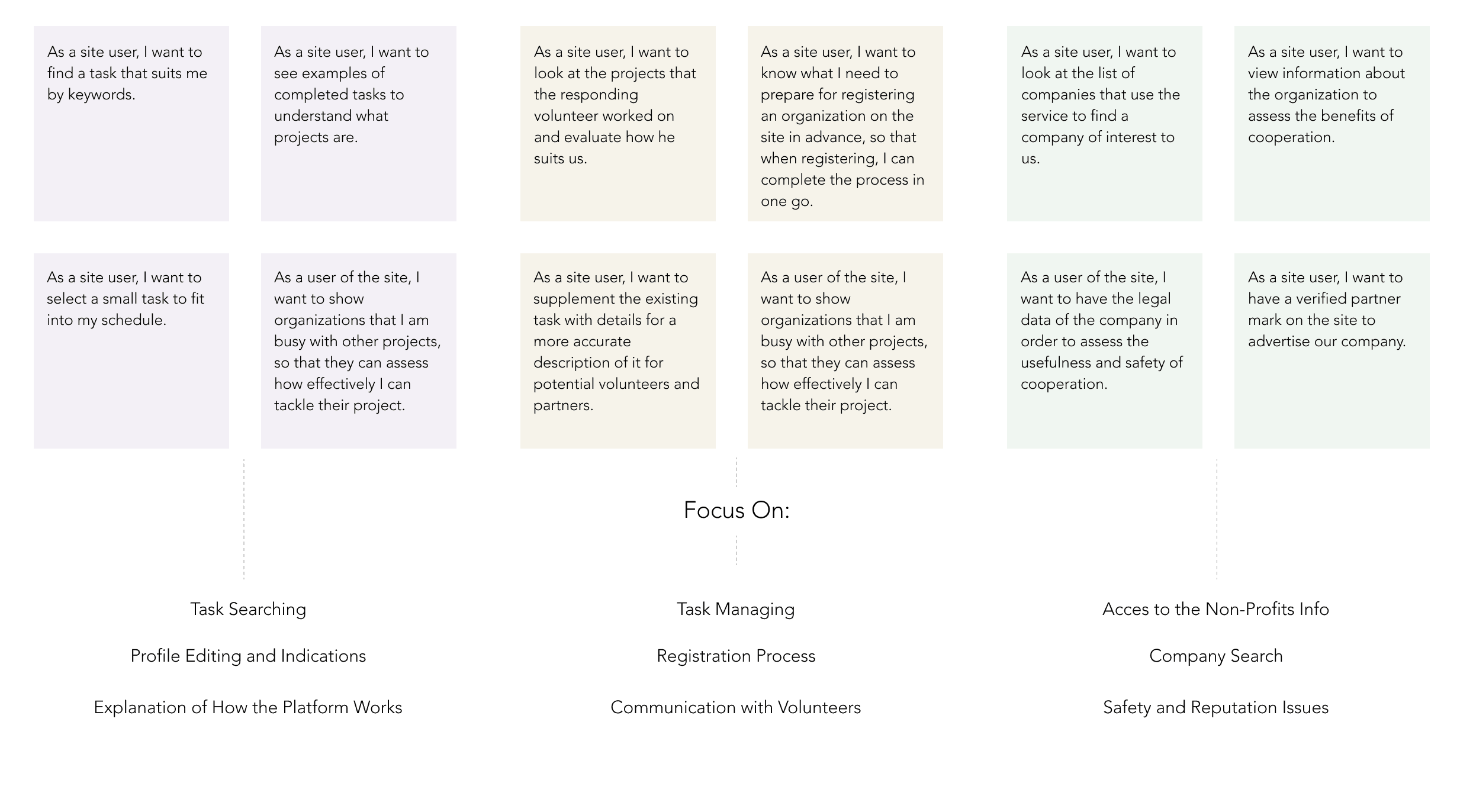
After competitor analysis, we created personas and wrote user stories for all types of our users, following which we defined areas for each user that we should focus on.
Information Architecture of the Platform
At this stage, the biggest problem for us was the interaction between all user groups. In general, we had three types of interactions:
• Users with the website itself (including account creation, getting info, and help)
• Interaction between users and task / profiles other users created (including task and volunteer searching, applying for tasks)
• Direct interaction between users (including task management, communication via comments, etc.)
As such, our second designer worked on the website’s information architecture to describe and explain how all these interactions should work.

Research
Survey
For better users understanding we conducted a survey to learn more about our volunteers. Volunteers are the biggest group of our users and for the survey, we were working in two main directions: for volunteers with no prior experience with such services and for users that already worked on some projects using online platforms.
I show here the survey summary and findings for the second user group - volunteers with online services experience. We had 30 participants answering questions about their experience and projects they were participated in.

Conclusion
What I Learned
For me, this project was all about the importance of research. It was quite a small project, however, in the middle of work, I realized that we had to find a way to conduct deeper and better research and not rely too much on our assumptions.
It was also quite an interesting project because we had very clear user types that helped us from the one side – we knew our target users well, but it also kept us thinking all the time if we were missing something, as it seemed too obvious.
Findings
We Forgot About Huge Group of Users
We did not realize it at the beginning of the work, but we could not let our volunteers, nonprofits, and companies fully manage everything. I think we did a pretty good job understanding what our users needed and now, we realized that for almost each task, we have a few steps hidden from the user (but aff ecting the process), such as admins approval for non-profit registration or task publishing that we need to design.
It was the responsibility of our second designer to build one more management system for the admin. There were not only standard admin tasks such as the option to edit and delete comments, but also many decisions on when we need and do not need admin approval, how long it should take, and how we should notify users and build communication between users and admins.
Research
Finding Right Direction
This project had a very small budget. Therefore, we focused our research on analyzing other websites for volunteers. I was also using the experience I had gained working on a few graphic design projects as a volunteer.
After competitor analysis, we created personas and wrote user stories for all types of our users, following which we defined areas for each user that we should focus on.
Information Architecture of the Platform
At this stage, the biggest problem for us was the interaction between all user groups. In general, we had three types of interactions:
• Users with the website itself (including account creation, getting info, and help)
• Interaction between users and task / profiles other users created (including task and volunteer searching, applying for tasks)
• Direct interaction between users (including task management, communication via comments, etc.)
As such, our second designer worked on the website’s information architecture to describe and explain how all these interactions should work.
We Forgot About Huge Group of Users
Solution
We therefore had to dig deeper and add another user group to all our scenarios. We reviewed our work, added steps to scenarios where needed, wrote user stories and flows for admin, and made changes to early design sketches that we had to meet new requirements.
There is an example of how the registration scenario looked before we added admin there and what we had to add to both user and admin steps.
There's an example of how registration scenario looked before we added admin there and what we had to add to both user and admin steps.
We Forgot About Huge Group of UsersSolutionWe therefore had to dig deeper and add another user group to all our scenarios. We reviewed our work, added steps to scenarios where needed, wrote user stories and flows for admin, and made changes to early design sketches that we had to meet new requirements. There is an example of how the registration scenario looked before we added admin there and what we had to add to both user and admin steps.There's an example of how registration scenario looked before we added admin there and what we had to add to both user and admin steps.We worked on user stories for admin trying to cover all the tasks that we discovered. We generally got basic tasks that work for many websites (comment management, helping users) and a scoop of tasks that are quite specific for this project - on approving tasks, verifying non-profits and companies’ registration, document management.


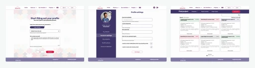
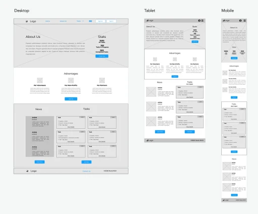
Design Development
Responsivity
At the beginning of development, we had two main directions for work: designing a similar but unique experience for all user types and working with responsivity as our research showed that we had diff erent devices and screen sizes for diff erent users. We also had to consider that we have pages that users see differently - with not exactly the same content and possible interactions.
Therefore, we started by designing more complicated versions of the pages and then changed them for other users' needs. These were typically task pages with different options for task creators and other users and user area where we had different approaches for all users.
From the start, we worked with the three screen sizes that we chose and developed pages similar to the home page and guide pages where we did not have statistically significant preferred devices according to our survey.
Design Development


